Showing posts with label Makeup-how-to. Show all posts

Saturday, 11 February 2017

How to find the right foundation?

To be honest, there is really no absolute right or wrong in makeup.
As much as makeup aims to eccentuate your natural look, it is also an extension of your personality, and we got to admit there are people out there who express more with makeup, even going avant garde with their makeup... whether wearing foundation too dark, too orange, too white or too thick... I say if you're happy and comfortable... crack on... That being said, I was inspired to make this post after experiencing how difficult it is to find 'the' foundation.

There are a few factors you have to consider to get the right foundation... it is more about your taste and what you want to achieve than just skin type. Skin type does play a role but again it still depend on how you want to look. I am oily and was always told to stick to matte foundation...but I really like more satin finish with shimmery highlighter. And I believe there are dry skin out there who loves a matte finish. There is always trick for you to get away with foundations that supposedly not for you. Just keep on reading.

The 'Right' shade
This is the most crucial part, hence the longer paragraph *rants*.
While foundation shades range from light to dark, there are also variety undertones. When I started wearing makeup, wrong undertone was the biggest problem by making my face look gray.
Undertone in foundation generally divide into:-

Cool tone
Contain Pink, Peach or Red. Give that rosy tone. 

Warm tone
Contain Yellow or Orange. Give that golden tone. 

Neutral
Mix of both cool and warm.


If you're not sure what you are, try and look it up, there are tons of articles available about finding your undertone. I like this one.

I myself am warm but I do have that slight olive undertone which means the orange in warm tone foundation can look 'off' on me. Olive undertone has a slight green mix into yellow undertone...which can be a bit tricky. This undertone is common among South - South East Asian, Latinas and sometime mixed people.  While reading up on internet I kept seeing different articles that sort of have different ideas on olive undertone. I myself believe olive undertone needs a slight green in foundation. Usually olive are categorized as warm, but as you go darker you find darker warm tone foundation tend to look orange which can look a bit 'off' on olive tone. Yellow green undertone foundation actually look very 'dead' on the bottle but it blends naturally in olive tone skin.

Does season matters?
It is also helpful to consider how tan you are throughout the years. This is more common with those living in 4 seasons country where they would use lighter shade in winter and darker shade during summer. I personally don't do that even after studying in Belfast for years. Instead of buying darker foundation for summer, I would just adjust with bronzers. Though I admit I do have a few 'accidents' of buying foundation tad too dark.

Generally you want to be matched exactly to your skin, that is a no-brainer. That being said, you would want to take into account on your perspective and preference on how you want your complexion to look. For example, usually people from 'West' have more appreciation for that tan healthy look, so they may still be happy even if the foundation is very the slightly darker than their skin.
Whereas I'm being typical Malay would like to look the brightest I possibly can would go for slightly lighter foundation, and I don't think anything wrong with that. This is similar to other Southeast and Eastern Asians like the Thais or Koreans. I don't tolerate foundation that give the slightest 'tan tint' to my skin, even if they blend in. It might still look 'good' but it's just not my style.  Another reason is also because my hands looks lighter than my face.


Now if you look the Lancome's cushion in 04 it looks clearly too gray on my skin, there was not enough yellow it in addition that it is tad too light. While 05 is just too dark, surprisingly not as orange but still. So you see skin like me have this problem everyday...no in between shades. But thanks to brands like MAC, NARS, Makeup Forever even Kevyn Aucoin and more I still manage to find my shade.
NARS Barcelona has a good mix of yellow in it and look how nice blends into my skin. 


I include swatches of my best matched foundation, and these are all swatches heavily compare to the Barcelona. If you look at the MAC NC42 there is slight 'green' cast to it really brightens up my complexion instead of looking sallow and dead.
Swatches in flashlight, look how grey the foundation could be without enough yellow.
 Of course I'm sure it is different for everyone. I feel the need to mention this because of the vast contrast between the beauty market in west and east. Tanning products are never a staple in Malaysia as how brightening products are not in the UK.
If you skip finding out what you prefer you'll find yourself dissapointed with foundation you get matched to.
 
From past experiences, I try to avoid getting matched from the get-go because I felt it can be misleading, being someone with yellow green undertone and preferring a slightly brighter shade, it can be difficult to explain well to the sales assistant.

TIP:
I find it is helpful if you sort of have an idea what shade you might be and suggest that at the counter. I try to find mine by watching youtubers/bloggers of similar skintone and use foundation matrix at Temptalia.
There are still wonderful sale assistants that just listen to customers well and match foundation to perfection. *Thank you Chanel and Illamasqua counters at Belfast Debenhams!*

Be patient while explaining and take your time while trying out at the counter. Never rush to buy a foundation unless it's 2nd bottle/tube.

Last resort is to get samples, try at home for a few days, compare to other foundation you have at home. Although this may only be availabe for higher end brand.

The Right Coverage
Coverage refers to how pigmented the foundation is, range from light to full.
While this may have to do with how clear your skin is, it is again up to you. Some who have crystal clear skin may still prefer full coverage. Even for me, despite having acnes, I find myself satisfied with medium to almost full coverage.
Now having said that each type of coverage can have pro and cons. Since now we have wider range of coverage, I just be simple in explaining.

The Lighter coverage
This means more of your skin comes trough, makes it more natural like your own skin, but also mean less flawless, and blemish is reduced only by little.
The BAD: this also can mean skintone is not fully even, might even look blotchy.

The Fuller coverage
So this mean less of your skin comes through, makes it less natural but more flawless and even tone. Your blemish can literally vanished
The BAD: If not applied well can give mask-like effect.

Don't forget, foundation coverage can dictate how much concealer you need. The fuller the coverage the less concealer you need.

The Right Finish
Welcome to 2016 where foundation finish is as advanced as your smartphone. When I started wearing makeup it is just as simple as dewy finish, satin natural finish and matte finish.
Now we have the modern formula such as demi-matte, glow from within look and more. Confused? I'll tell you there is no simple way of explaining the finish of new foundations nowadays.
So for those who new to makeup, I will explain the classic finish of a foundation.

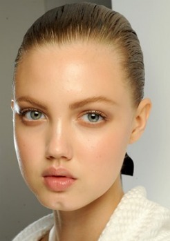
Dewy finish

Give the glow even a sheen to skin making it look lively, and even have fresh wet effect. Think Korean beauty ads. Usually associated with spring summer with lighter coverage, aim for those with near perfect skin.
The Bad: Those that contain shimmer which can make you look greasy and highlight pores.
https://66.media.tumblr.com/tumblr_lue490onx31qd9chs.jpg
https://scbeautyhigh.files.wordpress.com/2015/01/dewy-skin-how-to.jpg?w=1159&h=1739


Matte finish
This finish get rid of shine on your complexion and give a powdery finish. Usually associated with autumn winter and fuller coverage, aimed for those with oily and acne-prone.
The Bad: It can give a flat, dry, cake-like effect, can catch on dry patches.


http://ris.fashion.telegraph.co.uk/RichImageService.svc/imagecontent/1/TMG9734471/m/16-Dec-intro-pic_2423260a.jpg

http://ris.fashion.telegraph.co.uk/RichImageService.svc/imagecontent/1/TMG10298369/m/MAIN-VICTORIA-BECK_2666592a.jpg

There is also the satin or natural finish which what most latest formula try to emulate. It is basically mix of both dewy and matte . Although it is always hard to find the right balance between dewy and matte. This really depends on each individual foundation.
Like I mention above, I would ignore the specified demographic for each finish, even if you dry, you can go matte and even if you oily you can go dewy. Nowadays with these modern formula it is easier and there are things you could do to avoid the BAD from each finish. For example moisturizing well before a matte foundation to avoid dry flatness and powdering a dewy foundation to reduce the shine and oiliness.


The Right Type
Nowadays you could get foundations in many forms; in liquids of all consistency, from thick creams, gel-cream, to watery liquid. Then you have the  powder; pressed or loose. Then you got the cushion compact which is technically a liquid although I admired the convenience. Too bad I haven't found one of my perfect shade... Lancome UK recently come up with "Teint Idole Ultra Cushion" which is the second cushion foundation launch. It probably the first of UK brands to come up with cushion closer to most Korean cushion, which is matte and full coverage... alas... they make a big jump between a medium shade to dark, which left no room for someone with medium dark skin like me. I'll just stick to liquid. (see the swatches above)

We can't really says which form or type is better, it really depends on the brand and the formulations. Some of us might be prioritizing the convenience, so they like powder foundation but some might hate dryness from powder. However, now we are in 2016, there are powder foundation compact with better formula which is not too drying and not too forget the vast cream compact and cushion compact alternatives. Just find one or a few if you like that fit your cup of tea.


The last thing i like to share with you all is never get sucked in by the hype etc... now that we live in the age where Instagrammers and bloggers are trusted more than advert, you have to remember that a lot of these internet personalities got affiliate links and got paid for hyping something. It's good to get to know the latest trend and product but chances are you might still prefer your old favourites.I do admit it is quite difficult if you're just getting into makeup but I believe everyone went through that trial error process and eventually figure how they like their foundation to be .


MAC Studio Sculpt, Nars All Day Luminous Weightless Foundation, Chanel Perfection Lumiere,
Kevyn Aucoin Sensual Skin Enhancer
. Just finishing fast I am sharing my top favourite foundations. In terms of formulations, the first three are great and I can't say one is better than the others. But I must say MAC Studio Sculpt wins on other aspect, ease of application, tube packaging with extra 10ml (40ml tube) and works cheaper.

Studio Sculpt NC42 swatch
MAC studio sculpt in NC42 - the best match, and I use this as my reference when I am looking into other foundations.

Nars All Day Luminous Weightless in Barcelona
Nars all day luminous - either Barcelona or Syracuse + Stromboli (not shown in the picture)


Chanel Perfection Lumiere in 50 - slightly cooler, but still match fine, I tried 60 and 54 but it's darker and too orange for my liking.

Kevyn Aucoin Sensual Skin Enhancer SX11
I just starting to use the Kevyn Aucoin Skin Enhancer and I believe it is included in my top favourites and probably on par with MAC Studio Sculpt with how the shade SX11 match me.The only gripe with it is getting used to cream formulation.

I will do reviews on all these foundations, especially the MAC Studio Sculpt as I have been using it for years!

I hope this post helps and give some ideas especially for those just starting to get into makeup.



Saturday, 12 November 2016

Makeup look - Inspired by Antonio Marras ss 2016

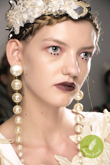
Of all the videos I like to watch on youtube, I like to watch backstage videos and makeup looks from the runways, thank you to Fashion TV.  So back in spring which was ages ago I was really awed by this makeup look from Antonia Marras SS2016. I guess this look was quite popular that I found another video by Adversus interview the MUA


This look was design by one of my favourite MUA, Tom Pecheux with MAC.
So I thought I share this inspired look which I adjusted into my style. He says you can take everything from the look and he's quite right. That is what I love Pecheux, he's adventurous but still chic.

Pic from junipers journal

Pic from Image.ie


The look is not exactly too out of the world. You still can sort of take one feature either eye or the lip, dots without dots.


 Okay.. I tried... lol. But you what I learnt, I learn to like pink and red on my eyes... usually I tend to  avoid, but thanks to this, I'm open to pink. *Hello Anastasia Modern Renaissance Pallete!*


Face:
Foundation as usual and  contour minimally. No blush.

Eyes:
Eyebrow is my usual and maybe a bit more minimal.
Eyes following true to the look following facechart would be just blush very soft warm pink
blend up to crease with  with silver pigment in the centre. Then 3 black dots on the bottom under the pupil/ iris.


I used MAC Paint Pot is Soft Ochre and contour slightly with MAC cork. Swipe softly a warm pink blusher from Elianto.

I then add Charlotte Tilbury Luxury Pallete Vintage Vamp, using the enhance shade for extra contour in plummy shade.
I used NARS Dual-Intensityin Dione, a pewter which is more wearable than just silver.


If you want to make it last or make pink more stand out, do pink base - with cream blusher or warm pink lipstick like MAC Verve+Twig.


He says the dots is for surrealism and I don't know how to translate that but its very unlikely I wear 3 dots like the original. So I subtitute with blended black accent on lower lashline at the outer corner. I add minimal mascara n softly blended brown line on the upper lasline again on outer corner to follow my natural eye shadow/contour.


We can carry on without the black  if it enough to define eyes with mascara +/- brown liner.


Usually I'll skip black eyeliner if I got striking shadows with striking lips but since I am inspired by Pecheux I still want that black under the eye. If I am bold enough I might just do the dots because overall it is still a well balanced look. However to be honest it is very unlikely... well who knows .


Lips:
Just a deepened plum colour lip and matte out with
dark matte bronzer. I use mac nightmoth
(similar to actual one used) but more matte/
dryer. He used MAC Velvetease in Velvet Teen which has more slip. Then achieve that 'rusty' effect with bronzer.

I add lipstick for more slip for the bronzer and to make it last longer with more packed
colour. I used MAC Hung Up and edges set with MAC  Mineralize Skinfinish Natural in Deep Dark.

That completes the look.

Saturday, 18 June 2016

Simple Midtone Orange Lipstick

I am no good with bright lipstick, but I could not help being attracted to it especially ORANGE believing that I might be able to carry it off. I have searched and searched for the best way to wear orange lipstick, googling for tutorials and celebrities pictures that can inspired me and without looking too dramatic.

Alas, the only way I found best is definitely to keep it simple.
It really depends on your skin tone, the orange you choose and the effect you want.
I want to have that edgy effect of orange in a elegant way.

Inspiration:
after seeing Tessa Thompson, I have sudden urge to wear my orange lipstick more often

I am not really into that ultra sexy bronze goddess look that would be achievable with warm gold bronzy smokey eyes, this look is what most tutorials and celebrities go for . But it is just too much for me, the orange is already bright enough for me. In addition to that, matching clothes and headscarf would be very tricky. You can go bright and light if you're up for it. But I really think the best colour to wear is definitely black like how you love the contrast in girls with dark black hair.

So I am just sharing with you guys how I would wear a midtone orange lipstick especially now that we're in spring/summer.


I opt for a dark brown headscarf instead of black just because of the top I am wearing and that there is no black at all in this outfit. But I tried before with black outfit and it probably match the best.


Base makeup: 
Wear foundation that match your skin and conceal as needed. 

Cheeks:
I definitely avoid blusher even the peachy one. It might look good but just not my style. I just go for bit of bronzers. Contour and sheer highlight as usual. 

EYES:
Just kept the lid bare, with just foundation/concealer or matte skintone eyeshadow.
Then contour slightly on crease and outer corner of the eyes.
I also put a bit of nude liner in waterline and sheer shimmer on inner corner for brightening 
Then the BLACK eyeliners. Go thicker if you want bolder. I definitely think a bit flick at the end compliment this look.

LIPS:
 Lined with orange lipliner followed by a midtone orange lipstick, a bit more toned down orange. I used MAC Mouth Off lipliner and MAC Alibi lipstick. Orange brown like MAC chili without the red. But unfortunately discontinue? or is it just available in certain place, because I think I remember my mum still buys this back in Malaysia, it's her favourite. On her fairer skin it looks like a mature brown orange. On me it can look a bit clownish, hence a bit tricky to wear. Generally orange can look too bright and clownish on me. My orange need some brown in it. 


Saturday, 14 May 2016

Complexion: Contour and highlight (PART 1) plus the un-prettiest sketches lol!

Not trying to be too artistic or what... lol. I'm just bad at drawing... period.
I  recently change something in my contour highlight routine and I thought I want to share it on the blog. But since I don't do videos and I don't have a proper camera, plus not having the best canvas and products to demonstrate this 'technique'... next thing I knew I was sketching on my phone (Samsung Galaxy Note) and I thought, well this is not too bad actually... hahaa!

In the 'old' days, contouring seems to associate to 'shaving off' a few pounds' and it does make sense,  since it give that chiseled effect, but it is more than that. You might think of this technique as a 'face changer' or making a 'dramatic statement' but I see it as a technique to bring your 'natural face' back. 

It's all about having dimension.

When we started wearing powder, then upgraded to higher coverage base like foundation and concealer, notice that that 'bland, flat' effect? If you're a malay, you probably familiar with the term 'muka tepung gomak'. 

Imagine putting your face with the same colour all over, however thin it may be, without any dimension, it will look flat and obviously made up despite going 'natural' sans blush, lipcolour and eye makeup. This problem maybe more common among guys as they don't really put colours in the face and those with darker skintone as the natural shadow would be less  obvious compare to those with fairer skintone...this also work the reverse way as well as natural highlight would look less obvious on fairer skintone.
While in the past this technique usually reserved for the professional, now after becoming a trend a couple years back, there are more information and more products available. Look at all the brands racing to bring out the ultimate "CONTOUR KIT".

For those who is not familiar, basically CONTOUR is putting 'shadow' (darker colour) on the 'trough' or 'depression' of the face, bringing those part 'down and in'. 
HIGHLIGHT is putting 'light' (brighter colour) on the 'peak' or the 'high-planes' of the face, bringing those part 'up and out'
If you study your face, you can actually determine these parts yourself. But if not, you could use the guide I provide below.
with only foundation on and some lipcolour. Look at the'natural' shadow where I outline
This is how I typically contour and highlight. It does not take too long after you get used to them.
The sketch below sums it up a bit more.
LOL... this sketch is too much... 


I have a darker skintone, so my natural shadow may not be too obvious. In addition to that, I have wide cheeks with baby fat, so base makeup like foundation can easily knock-out the natural shadow on my face making it look more 'made up'/unnatural. So contour bring back the natural shadow and highlighting is accentuating the 'structure' and again, dimension of the my face.

General tips on products:

CONTOUR
  • Strictly MATTE product so it does not catch the light hence give the opposite effect
  • Generally use a product few shade darker than skin tone
  • While bronzer even some blusher is generally 'acceptable' as contour product but the most ideal contour product would be a more cool BROWN with a 'GREY' undertone (how dark depends on your skintone)
HIGHLIGHT
  • Use both MATTE and SHIMMER with the shimmery product only on a few points. Shimmer/sheen/glow... all these catches the light, and bring up those structures. 
  • Glitter is fine generally but may be too unnatural and over the top. Avoid the chunky ones.
  • Generally use a product a few shade lighter than skin tone.
My usual routine...
CONTOUR:-
  • Hollow of the cheeks
  • Under jawline
  • Side of the nose
  • Outer corner of the eyes
  • Under the lips 

 HIGHLIGHT:-
  • Under the eyes
  • Bridge to tip of the nose
  • Forehead
  • Chin 
  • In addition to that, I add shimmery highlight but only on cheek bone and bridge of the nose, sparing the tip.
There are still more areas that you could contour and highlight, it really depend on how much effect you are looking for and you face shape as well ie. long face verse round face etc...

Hope that the sketches below explains more.
There is two type of highlighting product to use, matte and shimmery. Use either or use both. It is really up to you.
Matte highlight is less risky than shimmery highlight, as shimmer product could make you look a bit shiny, oily and like a disco ball. If you hate that don't do it. If you like that, and skin is dry, go nuts... but I personally keep the shimmery at key points. 
Now highlighting nose, it use to be just on the bridge of the nose, but I can't deny there is a trend which include highlighting with shimmer on the tip of nose... I guess if it works... continue on. 
I did watched Wayne Goss on youtube commenting on this, kinda funny...
The classic technique of highlighting with shimmery product is to apply in "C" shape from the brow bone to the cheekbone. Even if you don't do the whole shabang, just use this technique and it still make a different. This is the first technique I actually introduce in my routine.


The classic technique for contour is to apply in '3' shape which start from temple to hollow of cheeks and to under the jawline... or you could make it a three C shape by extending from outer forhead. 
Like I mention stick to matte product... shimmer catches light therefore it highlights (the opposite effect of contour). Only those with very prominent hollows in their face could get a way with shimmery contour, because with deeper hollows it is more difficult to catch light. 
Now the risk of over-contouring. Imagine just having a bland foundation then contour with grey tone brown... it potentially make you look 'sick' or harsh... 
So a great tip is to blend contour with bronzer or even you blush. This is great as it soften the grayness from the contour and give healthy look to your complexion. 

Now if you notice in the sketches, HIGHLIGHT is mostly done in CENTRE of the face as that is where it 'bulges' out and CONTOUR is mostly done at the OUTLINE of the face. 
If you are familiar with with 'Korean style' makeup, they basically follow this rule. Instead of the typical shadowing in the hollow of the cheeks, they prefer to 'shave' off the jawline and put shadow on the outline the face. These steps basically to fulfill their beauty 'standard of having a 'small face' and a 'V' line jaw. 

So like I mention earlier it really depends on what you are trying to achieve. Like myself I'm just trying to get back that dimension and give structured look to my face. It's not just about looking 'thinner'. 


Not all of us have the same face shape, and depends on how much and type of products used, contour and highlight can have a subtle or major effect on how your face shape appears ie. natural vs 'Maleficient' like sharp cheeks.
I just also have to share this article by Beauty Editor on Nick Barose. We got to admit contour and highlight has gone a bit too far and it sort blurred the line between reality and filters, practicality and long winded routine... my thoughts really resonate with what Nick Barose was saying on beauty greed. 
This sound cliche but it needs to get out there. 
In PART 2, I will explain about products to use including the product I used in my routine.

Saturday, 16 April 2016

FOTD - Reddish brown lips with coppery eyes

This was a look I wore a few weeks ago, nothing too special to be honest.
Just a reddish brown lips and coppery eyes.
Full makeup list down below. Since this is quite recent I actually can list down exactly what I used.
this is after I got home... could not help that my makeup faded a bit, I actually touched up my lipstick a bit.
FACE:
Prime my face with Charlotte Tilbury Wonder Glow - focus on cheeks, under eyes, forehead, chin and bridge of the nose.
L.A. Girl Cosmetics PRO Conceal HD Concealer Green Corrector - to colour correct redness  ie. blemishes/acne and redness on my scars, and corners of the nose.
MAC Studio Sculpt Foundation in NC 42 on whole face.
MAC Studio Sculpt Concealer in:-
NC  35 - blemishes/acne
NW 30 - undereye grayness (pink undertone)
NC  30 - undereye (on top on NW 30) and also high points for highlight - cheekbones, centre of forehead, bridge of the nose and chin.
(I know this is ludicrous number of concealers, but I have them so why not use them)
MAC Prep+Prime Transparent Finishing Powder to set all the base makeup

CHEEKS:
Contour with MAC Cream Colour Base in Mid Tone Sepia  and MAC Sculpting Powder Pro in Shadowy - under the cheekbones, side of forehead and side on bridge of the nose.
I also dust some Chanel Les Beiges Healthy Glow Sheer Powder in No. 30 to blend and give warmness on my skin as shadowy is more of a gray brown (perfect for contour).
Since NARS Multiple in South Beach a bit too pigmented to be used as my usual highlight, I mix with Aesop Parsley Seed Anti-oxidant Serum to dilute it. Apply on the cheekbones and top it off with MAC Mineralize Skinfinish in Soft and Gentle.


EYES:
Prime with Urban Decay Eyeshadow Primer Potion.
MAC Paint Pot in Quite Natural from lashline blend toward crease.
The copper on my eyelid is actually a cheek product from The Bodyshop old collection 'Autumn Leaves' in Chestnut. On me it's really a toned down copper but there is that hint of vermillion *like a red orange* in it which I think would show up more on fairer skin. To me it's too much to be worn on cheeks as I am not really a blush person.
MAC Cork on crease.
MAC Mineralized Eyeshadow Duo in Play on Plums , the burgundy on crease and the peachy gold as highlight softly on the brow bone and on inner corner, on top of Topshop Crayon in Whisper.
MAC Brun on lashline.
MAC Extended Play Gigablack Lash mascara
On brows I use MAC Brun and NARS Brow Gel in Kinshasa

LIPS:
I still feel even on eyes it was too much that I would only paired with a more muted colour on lips. Not too dark or bright but I don't want to do nude natural, so MAC Lipstick in Paramount comes to mind, but I thought I want to use something different and go for Charlotte Tilbury Matte Revolution in Birkin Brown, which is similar to MAC Paramount, but less red.
I filled in first with MAC Lip Pencil in Mahogany and follow by the lipstick.


DONE!

Monday, 6 April 2015

Ladylike with Dark Purple Plum Lips

note: these are old pictures... like waaaayyy old.

Now, I don't remember what year was it, but there is this one time, beauty/fashion industry was starting really appreciating very dark purple lips.Following that 'trend' now a lot of women of general population are pulling off dark purple lips casually. Prior to this, dark purple lipstick is usually associated with 'halloween' 'goth' 'punk' 'sci-fi' etc etc... lol and even I generally would not go for purple on lips.... 
However it really interesting how  they take this with a 'modern' twist. despite the usual goth- punk 'image' portrayed with this lips, they(the industry) came up with something so 'ladylike'... despite the darkness of the colour on lips, the whole look is actually soft. This is interesting. I'm all into very dark lips and 'purple' could be a great experiment.


So I got this palette from MAC, the 6 Select Plums Pro Lip Palette for some time and this was the only palette that have all the shades that I don't own in a tube. Since I saw Cyber (bottom left), I just couldn't stop myself thinking about attempting this look. From the palette, you can clearly see how much more purple and dark it is... and you practically need to be a 'zombie' to wear this 'naturally'.

Let me be honest, it is hard to pull off Cyber looking ladylike especially if you compare to Hang Up (the shade next to it), it is more dramatic, 'punk-y' *?*  and it is so dark and so purple but trust me it is achievable.
So I hope this post help you guys not to shy away from trying this lip colour. 

Complexion:
As dark purple lipstick could be very dark and dramatic, having a much more 'tanned' and 'dark' skin will ease the 'goth' effect of wearing this colour. So I don't have much problem with my skin tone, but those with fair with cool undertone skin, you could try to bronze up a bit, and that actually make this less 'harsh' on your skin tone. It is also great if you have blonde or ginger hair or in my case I opt for warm beige headscarf. 
I think cheek colour would be too much personally but people might feel it put the whole look together, so if you want go with a more soft 'mauvy' 'plum blusher or even something rosy as we can add to that 'ladylike' effect.


Eyes:
I just maintained my usual eyebrow with eyebrow gel and bit of dark brown shadow.

I primed my eyelid top and bottom with MAC Paint Pot in Painterly and start with matte light cream eyeshadow. Then I contour with matte midtone brown MAC Cork to enhance the contour which would be the socket, lower lashline.
The the important ladyline effect would be a simple black winged eyeliner only on the top lashline.
Highlight the inner corner with light shimmer shadow and you could put white or cream or light shimmer in the waterline.
I finish off with black mascara.


Lips:
As I mentioned above, I used MAC Cyber and I lined with lipliner I think MAC Dervish. 
I would wear darker purpler lipliner if I have but I don't and I want to finish using MAC Dervish.
In conclusion I would advice a lipliner to give of a cleaner finish and I think Cyber really work best as opaque and with clean edges. Finish!


Ok gila! Can't believe I'm in second semester of 4th year! And  4th year is crazy annoying, after every block there is assessment. Good news, I pass semester 1 exam and that include paeds and psych which is good. Hopefully I can finish this year without any resit. I also realized many of my friends is finishing this year as well, ahh man... sedih but I'm still happy for them all. 
*still fighting for this blog*

Thursday, 19 June 2014

2 in 1 post - How to Bright Pinks lips and Review: Lipstick Queen Sinner Lipstick in Pink

To be honest I can't really remember the real reason I bought this lipstick...
I know I was entering Space NK to look for an everyday kind of shade of Nars Matte Velvet pencil... but I was 'pulled' by the SA for this... hmmm. Now this might sound like my fault for not being outspoken about I actually want but actually I was drawn to this range as well.
The Sinner Lipstick range by Lipstick Queen is probably all I ever wanted in a tube of lipstick, 
"inspired by the decadence of the 1940s, Sinner Lipstick combines high levels of pigment with a matte, yet silky texture for a shot of intense colour minus any weight or chalkiness With 90% pigment, Lipstick Queen's Sinner Lipstick is make-up for your devilish alter-ego. The smooth, opaque formula delivers rich, matte colour that's lightweight, nourishing (thanks to Shea Butter) and hard-wearing. There's no shimmer, glitter or opalescence - just bullets of dense pigment for a modern take on old school Hollywood glamour. "
Sinner Lipstick in Pink, MAC Prep+Prime Lips, MAC Dervish lipliner, Eco-tools lipbrush
Matte, pigmented, no shimmer... totally my style. But the problem here would be the colour that I was matched to.

It is delusional to count this lipstick in Pink as my 'my lips but better' (MLBB) shade or a neutral, because it looks BOLD pink on me  [full stop].  I feel that I should have never got it in the first place... It looks good (enough) .. but bright bold pink just personally normally not my style. Plus I already had MAC Pro Longwear Lipcreme in Unlimited and that is enough. I was more looking for more muted, low key pink, something like MAC lipstick in Spirit. MAC Spirit is perfect especially with Whirl lipliner.. but I never really wear it, because I just want to get rid of this bold pink lipstick and wear it often 'RELUCTANTLY'... 
You wouldn't want to waste a 20 pounds lipstick right... erghhh (annoyed).
Sinner Lipstick in Pink - too bright for my taste

As I wear it often, I can fully judge its texture. Now I don't know if I really like it. It is matte and it does not transfer much, and probably this is what the SA meant that this line has like a 'latex'-like substance so it just stick on.
But sometimes I felt it is a bit too dry... I wonder if the colour make the texture felt worse, look all dry and chalky. So as often I would wear it (to get rid of it) the more hatred I have for it, so at one moment where I just felt I look too tacky wearing it... I end up tossing the lipstick in the bin.. hahaha! (please.. I am still recovering from the fact I toss away a 20 pounds lipstick)
I would probably like this lipstick in darker shade, like a dark brick red or a burgundy.That would be perfect as those non-transferable lipstick.
On the other hand, I still like this brand, and the packaging is really nice, matte tube with gold print label, tightly sealed and you wouldn't find this lipstick without the lid when you just throw it into handbag.

So overall, I would give still give a 2.5 / 5, (a bit higher just because I believe I would love the darker shades). Unless you really want that bright bold 'dry' pink lipstick, go for the pink shade...

If you feel your PINK lipstick looks TOO BRIGHT/ BOLD but you know it's not really your style. So to tone down the 'bright' pink bubble gum look, just tone down everything else...Say no to pastel obviously.
Cheeks: Do not do pink blusher or any blusher at all. I just stick to contour and warm highlights.

I think this was edited in my phone and other pics was edited in my laptop,
so it's a bit different in the undertone and temperature.
Eyes: Stick with warm earthy tone on the eyes and no black eyeliner (even for darker skin, go for the darkest brown expresso like liner you can find but no black).


I used a light gold syadow on lid with matte brown (MAC Cork) in the crease to contour, a dark brown pencil eye liner on upper lashline with a bit of flick at outer end. (a bit of cat/kitten flick is a must for me)


Since I wear a bit of green in my headscarf, I use this N' 7 Metallic Eyes Pencil in Bronze on my waterline and apply a bit thicker in the inner corner. It has a kind of a 'khaki' undertone, a bit different from a typical copper and I like the shimmery 'twinkly' effect on the inner lower lashline.It gives a nice 'bohemian' touch to my whole look and make me forget about how bright my pink lipstick is. 

OR another style...
Instead of earthy tone eyes, keep the eyes clean and go for 60's inspired look with solid black eyeliner on top lashline and a pronounced cat flick to take up a notch. (Inspiration from MAD MEN especially Betty Draper/Francis. *love*)

Monday, 10 June 2013

Looks: Inspired by Dolce Gabbana Spring Summer 2013

I like Dolce Gabbana collection for Spring Summer 2013, it's quite bohemian, classy and colourful, at the same time very earthy. Since there's lot of colours, I can see how Pat McGrath opt for neutral palette for the makeup. I think most Dolce Gabbana makeup base on neutral colour with some alluring cat eyes. Pat McGrath describe the look as "Sicily-an holiday - sunny beautiful Sicilian faces"


So it's been a while since I post a look on myself, to be honest there's nothing much 'too' interesting in this look, but I was just playing around with makeup after a long while I have restrained myself because of exams week, so I thought I should just post this up.
The makeup used for this look
This is what I come up with:-

A little disclaimer here: Please excuse the quite over the top photoshopping, I basically  just 'glowing' lol... but I didn't expect that today is not sunny enough and my trashy BB camera couldn't pick up enough light. But hopefully it still give an idea of the look.
I list down exactly what I used and plus if there's any different from Pat's actual Dolce Gabbana look. As far as I know, she used Dolce Gabbana Makeup. You can get more information here.


Face makeup:
Vichy Dermablend Fluid Corrective Foundation 16 hr in 45 Gold
Clinique Superbalanced Makeup in Wheat
I mix the Vichy with a bit of the Clinique as it is a tad bit too light for me.
The Bodyshop Concealer Crayon in 05 to conceal any blemishes, under eyes and redness
MAC Mineralized Skinfinish Natural in Medium Dark and MAC Blot Powder in Medium Dark as well to set the base.
Since Clinique Superbalanced Makeup in Wheat is quite dark I used as base contour on hollow of my cheeks, side of nose, side of forehead.
I set the contour with MAC Mineralized Skinfinish Natural in Deep Dark and further contour on my jaw and kind 'connect' side of the nose to the brow and follow through the socket.
For blush I used MAC Bronzing Powder in Bronze on the cheeks and I highlight the top of the cheekbones and my nose bridge with MAC Mineralize Skin in Soft & Gentle.
In Pat McGrath's version, she put more blush than I did, and she didn't mention any highlighter, but most important and obvious she also put bronzer on the the browbone as well. 


Eyes:
MAC Paint Pot in Painterly on top lid only, and a wash of the Revlon Matte in Vintage lace over it.
On the socket, a bit of MAC Eyeshadow in Cork.
MAC Fluidline in Blitz and Glitz (the only gel liner I have), to make a quite thin, a bit elongated and flicked slightly upward. 
No 7 Metallic Eye Pencil in Bronze in the waterline. 
MAC Zoom lashes mascara on top lashes.
Rimmel Professional Eyebrow Pencil in Black Brown and set with The Bodyshop Brow Gel.
In Pat's version, she had a white wash on the top lid and this was more obvious than me. And I just realized she used a black inside the eye, when I thought it was something metallic brown *silly me*, although I really like the effect. 
(My undereye is a bit dark because I messed up a bit and I removed it including the concealer, and I didn't bother to put back some concealer, hehe.)


Lips:
MAC Lipliner in Spice all over the lips to get that almost peachy nude lips.
Top with mix of Revlon Colorburst in Sienna with Rimmel Apocalips in Nude Eclipse.

Thursday, 10 January 2013

Makeover - past runway inspired Twinkle Fall 2009

So I thought of this look from this video that feature Gregory Arlt from MAC for Twinkle Fall 2009.
Despite that it's from 2009, it still relevant and this look good for all year round. 
It's inspired by the 50's although much more softer as Arlt says it's the teenager daughter that watch her mum do her makeup, so instead of a cat eye, it's a 'kitten-eye'
Instead of a flat matte as in the 50's, it's more luminous and shimmery with the eyes are swipe with something silverish pink (Naked Lunch by MAC) and an orange red lips (Lady Danger).


So I did the look on my sister and I notice how this look very good with a cream headscarf.


Base:
Mix of Revlon Colourstay in #Toast and Photoready Makeup in #Vanilla and adjust to my sister's skintone. The finish of this mixture will give the right amount of dewyness and shine control.
Conceal under eye darkness and any blemishes with MAC Studio Sculpt in NC30
Set with MAC Blot Powder in Medium Dark.


Eyes:
Sweep MAC Naked Lunch eyeshadow to the lids.
Line the upper lid with MAC Fluidline in Blitz and Glitz (the only one I had)
The eye-liner should quite thick  and not too extended. Then the outer corner slightly flick (very subtle)


Lips:-
Line and fill the lips with orang tone lipliner, MAC Lipliner in Mouth Off and follow by MAC Lipstick in Alibi. I made the lips less red and more orange peachy than the Twinkle one, but it's still matte.


Face colour:-
Soft contour with MAC Minerealize Skinfinish Natural in Medium Dark. This should be more subtle for that younger 'teenage' look, if the contour too apparent it's more mature than it should be.
Blusher on the apple of the cheeks Elianto Studio Blush in Nude Pink.
Dot the liquid hightlighter Tony Moly Crystal Light Pink Beam on the cheekbones and other high planes of face. Set it with MAC Irisdescent Powder in Verve-acious.
I blend it more freely into cheeks and get the hyper-luminous cheeks and dewy complexion which is in contrast with the more matte complexion of the 50's.


If you're oily, keep the dewyness down a bit especially on hot day weather 
*let say when I'm back in Malaysia*